Feature illustration, "A Long-Playing Medicine"
LIFE magazine, June 10, 1957

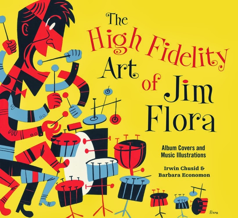
The mischievous and diabolic art of James Flora (1914-1998):
Glimpses of rare works from the archives
and news about Flora-related projects
 Flora rendered the above woodcut for the cover of a collection of short stories by Alvin Frederick Levin, published by Little Man Press in 1940. New Directions Books has just issued Love Is Like Park Avenue, Levin's "unfinished novel," which includes the "Little Alvin" vignettes and a reproduction of Flora's woodcut.
 Spot illo, "New Competition for G.E.," a brief 1953 article about Continental Electric Equipment Co. of Kentucky.
 Anthropomorphic lobsters from sketchbook, pencil and crayon, early 1960s. Intended project unknown.
 Acrylic on canvas, 1992. Irving Milfred "Miff" Mole was a legendary American jazz trombonist who first came to prominence in 1920s hot jazz. Tommy Dorsey called him "the Babe Ruth of the trombone."
 Our third series of Primer for Prophets screen prints are in production, and should be ready for market by early October. "W" is among the featured letters. For more information, click on the "Primer for Prophets" tag at the bottom to see previous posts. The series is being produced by our friends at Aesthetic Apparatus, of Minneapolis.
 Flora loved experimenting with hand-typography throughout his career, from the 1930s to the 1990s. (Click on tag below to see previous examples.) He occasionally created anthropomorphic letters. The above detail derives from an undated 1990s-era painting entitled The Many Aspects of Love. The large-scale tempera is a lower-tier work reflecting Flora's libidinous streak with cartoonish figures, a recurring theme which usually makes us cringe. However, the lettering of each word in the tableau demonstrates Flora's playful approach to the alphabet. We'll publish the other words in subsequent posts.
 Rave review for Sweetly Diabolic from Joe Bendel of J.B. Spins.